Towards a New Brewing Chart | 25, Issue 13
Compared to many other important food products, brewed coffee has unfortunately received little academic attention.

Postdoctoral scholar SCOTT FROST, PhD candidate MACKENZIE BATALI, Professor JEAN-XAVIER GUINARD, and Professor WILLIAM D. RISTENPART share the results of sensory descriptive experiments at the UC Davis Coffee Center, revealing new trends in brewed coffee that suggest an updated brewing control chart.
There are many academic programs focused on wine, beer, citrus, or almonds, but academic programs focused on brewed coffee are still in their infancy. As such, the history of academic research on brewed coffee is relatively sparse.
One glowing exception, however, involves the work of Ernest Earl Lockhart. A biochemist who received his PhD from the Massachusetts Institute of Technology (MIT) in 1939, Lockhart had a fascinating career: among other things, he helped explore the frozen wastes of Antarctica by dogsled in 1940 (where presumably he developed a passion for hot coffee!). He later researched and taught in food science at MIT, but to coffee aficionados his most important contributions were as director of the Coffee Brewing Institute, which did early work in coffee science.
In particular, Lockhart made a seminal contribution to coffee science with a paper in 1957, titled “The Soluble Solids in Beverage Coffee as an Index to Cup Quality.”[1] In this paper, he proposed a pretty radical idea for his time: that you could describe how good your coffee is simply by measuring how much of the coffee grounds dissolved into the liquid. In modern terms, we call this measure the “total dissolved solids” or TDS of the coffee. Lockhart also pointed out that the TDS is related to the “extraction yield” or percent extraction (PE), which means the fraction of the coffee grounds that have moved into the liquid phase, and that the TDS and PE are linked by the “brew ratio,” which is how much water you use per mass of coffee grounds.

An older version of the Classic Brewing Control Chart that still includes prescriptive and descriptive information. While the classic chart had zones that indicated a single sensory attribute (“bitter”), the rest of the zones made qualitative judgements about the coffee ("under-developed"). More recent versions of this chart have removed these words.
Lockhart’s work culminated in the classic “Coffee Brewing Control Chart” (figure 1), which has the TDS on the vertical axis, the PE on the horizontal axis, and the brew ratio as diagonal lines. All of the quantitative numbers on this chart are derivable from mass conservation arguments,[2] but the distinguishing characteristic of the chart is the overlaid sensory descriptive attributes. To the left at low extraction we have “under-developed” flavors (which are usually interpreted as sour or grassy), to the right at high extraction we have “bitter” flavors, and vertically we have the modifiers “strong” or “weak” at high or low TDS values respectively.
Most prominently, in the center of the chart resides the “Ideal– Optimal Balance” region. The idea is that if you control your brew such that the TDS and PE are within the ideal region, you’ll have a good cup of coffee. The classic Coffee Brewing Control Chart is the main focus of the SCA Brewing Handbook and corresponding classes on coffee brewing offered by the SCA.
Lockhart clearly advanced our understanding of coffee brewing; his control chart is now widely used around the world by coffee experts to evaluate their brews. At the same time, however, thought leaders in the coffee industry have long recognized that the classic chart suffers from a few deficiencies. First, the chart conflates sensory descriptive attributes (“What does it taste like?”) with consumer hedonic preferences (“What do consumers like?”). These are not the same thing, but the chart assumes a “one-size- fits-all” approach to coffee brewing, despite the reality that some consumers might, for example, prefer coffee that is more or less bitter. Second, the chart is divided into nine rectangular zones that suggest minor changes in brewing parameters portend a large change in sensory attributes. Most coffee experts will not be able to distinguish coffee brewed to 17.9 percent versus 18.1 percent extraction, but the chart implies they have very different sensory attributes.
Third, and perhaps most importantly, the classic chart completely omits the rich variety of flavors that we now know can occur in coffee. Most readers of this publication will be familiar with the tremendous variety of flavor attributes listed in the updated Coffee Taster’s Flavor Wheel released in 2016. The flavor wheel features dozens of flavor attributes, including desirable attributes like blueberry, dark chocolate, orange, jasmine, hazelnut, and vanilla, as well as less desirable attributes like rubber, petroleum, musty, and cardboard. In all, there are 105 different flavor attributes in a lexicon developed by World Coffee Research (WCR) and the SCA and statistically organized into a wheel by researchers at UC Davis.[3] This rich variety of possible flavors is a testament to the complexity and diversity of brewed coffee.
The classic Coffee Brewing Control Chart, however, reduces all this complexity down to just two attributes, bitter and under-developed. Clearly, an updated chart is in order.
Towards that goal, the UC Davis Coffee Center was delighted to partner with the Coffee Science Foundation and Breville Corporation to work on updating and expanding the classic Coffee Brewing Chart. The main idea was to perform a series of detailed “sensory descriptive” experiments. In this type of testing, we ask trained (expert) panelists to assess the intensity of various flavor attributes, such as “smoky,” “citrus,” “bitter,” etc. We trained them on the WCR tasting lexicon with appropriate sensory references, so that they could assess the intensity of each specific flavor attribute in the brew, on a scale of 0 to 100.
Coffees from different regions are known to have very different flavor profiles, so as a starting point we chose a representative “clean” wet-processed coffee from Honduras. In preliminary experiments, we roasted the coffee to different levels (light, medium, dark); in subsequent experiments, we systematically varied the brew temperature for a fixed roast. For all the brews, we used a Curtis G4 commercial coffee brewer and adjusted the “water pulsing duty cycle” so that we could achieve different TDS and PE values using a specified brew ratio. Our goal was to have our expert panel evaluate coffees in each of the nine main zones in the classic Coffee Brewing Control Chart.
With 9 target brews, 3 roast levels at 1 brew temperature, 3 brew temperatures for 1 roast level, 30 flavor attributes, 12 panelists, and with everything tasted in triplicate, we ultimately acquired more than 58,000 unique sensory descriptive data points, plus corresponding physical measurements of the TDS and PE of every brew. This is a lot of data! A key challenge is to clearly communicate the main trends. Here, we focus on illustrating the type of data we are getting and how we analyze it.
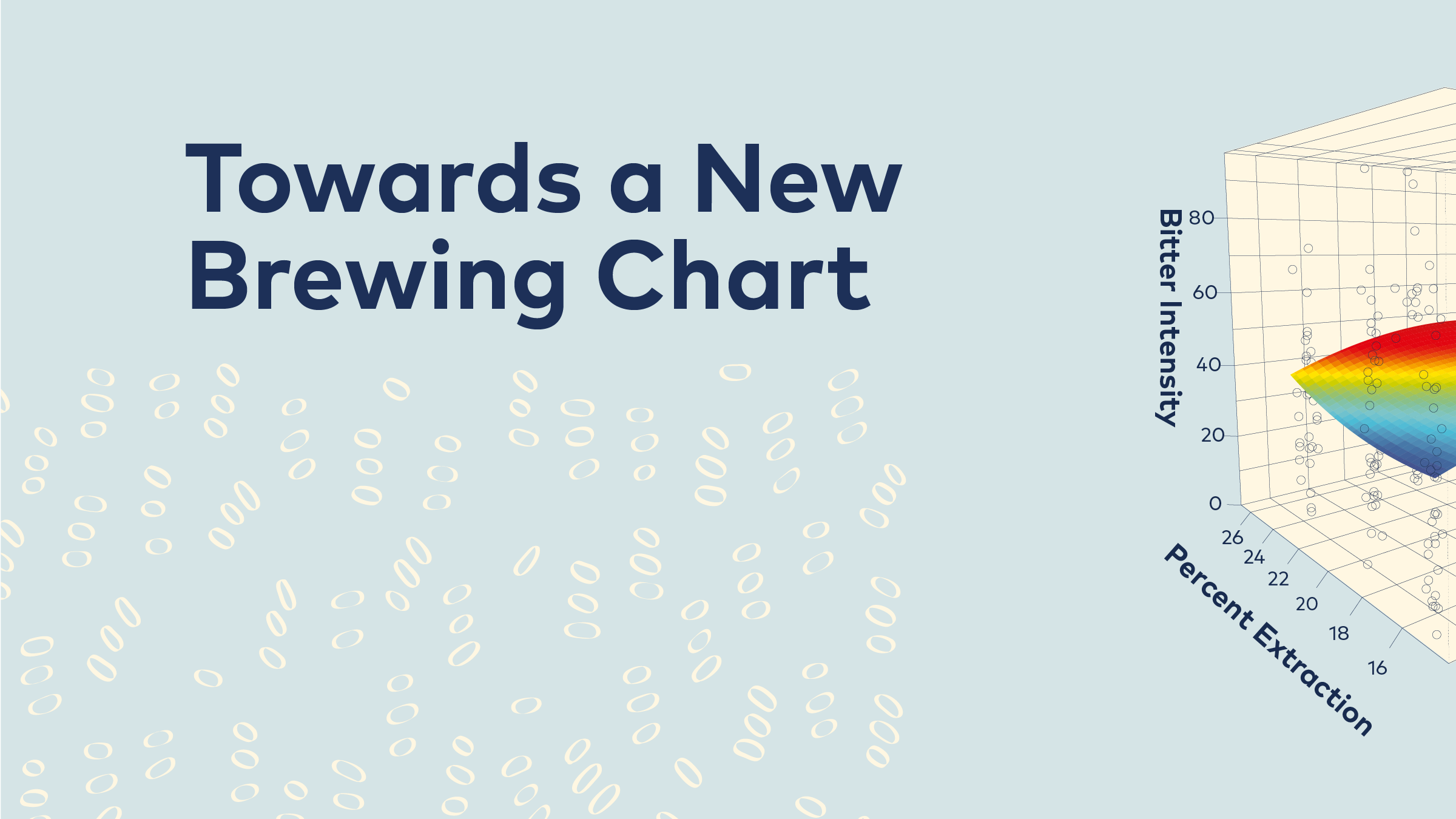
Since we systematically varied two different variables, the TDS and PE, we can create a 3D plot of the intensity of a specific flavor attribute. Figure 2A shows the results for bitter taste for a medium roast. The two horizontal axes denote TDS and PE; the vertical axis is the perceived intensity of bitterness, where the individual data points represent the mean response of all 12 panelists for each of the three trial replicates.

The results for bitter taste for a medium roast. Each column of bubbles represents a different combination of the variables (PE and TDS), with the bubble’s height on the column indicating how bitter the sample was perceived to be (bitter intensity).

Identifying the statistically significant trend using “response surface methodology” (RSM). The colored plane running through the middle of the cube indicates the “best fit” model for the data points. In this case, it’s easier to see a general trend that bitterness increases with both TDS and PE (the red “peak” at the back).

A two-dimensional contour plot of the RSM shown in Figure 2B. Similar to a topographical map’s lines of equal altitude, the “iso-intensity” lines indicate where intensity is equal. This shows that bitterness peaks in the upper right region of the brewing control chart, which matches Lockhart’s original chart.
This representation might look a bit confusing, but there is actually a statistically significant trend lurking in it. To find that trend, we use a fitting technique called “response surface methodology,” or RSM. The RSM technique is in effect a three-dimensional version of finding the “best fit line” in regular two-dimensional plots, except that we are fitting a plane through a cloud of 3D data points instead of a line through a series of 2D data points. The corresponding RSM fit for the data in figure 2A is shown in figure 2B. Here we can see more clearly that in general the trend is that bitterness increases with both TDS and PE. To show this trend even more clearly, we can instead represent the RSM plane using a contour plot (figure 2C). The contour plot, which is similar to a topographical map, features “iso-intensity” lines where the intensity is equal (much like a topographical map shows lines of equal altitude). This representation very clearly shows that the bitterness peaks in the upper right region of the brewing control chart, i.e., at high TDS and high PE. Importantly, this result qualitatively agrees with Lockhart’s original chart.

Additional Contour Plots: Although grouped together here, each contour plot can be thought of as a little mini-control chart for the specific attribute it represents. The vertical axis measures how strong the coffee is (TDS) and the horizontal axis, how extracted it is (PE).Top left, the plot for burnt-wood/ashy shows that this attribute increases in intensity when both PE and TDS increase. While it’s tempting to assume this is the case for all attributes, the three other plots tell a different story. Bottom left, sourness increases when TDS increases but PE decreases (i.e., the stronger you make the coffee, or the less you extract the coffee, the more sour it’s going to be). Top right, dark chocolate increases when PE increases and TDS decreases (i.e., coffee brewed at a high percentage extraction but lower TDS will maximize dark chocolate attributes). And, bottom right, sweetness is maximized at low TDS and low PE, the exact opposite of burnt-wood/ashy.
We are not just limited to bitterness, however; we have obtained many different statistically significant RSM plots. Four more additional representative RSM contour plots are shown in figure 3. Starting with burnt-wood/ashy (top left), we see that it behaves quite similarly to bitterness, in that it increases with both TDS and PE, albeit with lower overall intensities. In contrast, we see that sourness behaves in a very different manner (bottom left). The sourness intensity increases with TDS but decreases with PE, so that it peaks in the upper left corner of the chart. Again, this result is in qualitative agreement with Lockhart, since “under-developed” is often interpreted as involving a sour flavor.
Most of our measured flavor attributes behaved similarly to bitterness or sourness, in that they generally increased with TDS. Surprisingly, some flavor attributes decreased with TDS. An important example is sweetness (bottom right). We find that the intensity of the natural sweetness in the black coffee actually decreases with both TDS and PE, such that the peak sweetness intensity is in the lower left zone of the chart. This result accords with recent coffee fractionation experiments that demonstrated an inverse correlation between TDS and perceived sweetness,[4] but delivers brand new information in the context of the classic brewing control chart. Finally, in some roasts a handful of flavor attributes decreased with TDS but increased with PE, such as dark chocolate (top right). The intensity of dark chocolate in this example peaks in the lower right corner of the chart. Both the sweetness and chocolate examples suggest that the vertical delineation of “strong” and “weak” with respect to TDS in the original chart is potentially misleading for some flavor attributes, since they actually become stronger at lower TDS.
Our first set of results, focused on roast level, was published recently in the Journal of Food Science.[5] We emphasize the results there, and shown here is just the tip of the iceberg—we have much more data currently undergoing scientific peer review, and we are working on collapsing all of the flavor data into a concise format for use by the coffee community. Here we focused on sensory descriptive data, but excitingly we also have consumer preference data versus TDS and PE. Manuscripts on these topics are in peer review. But for now, we’d like to think that Dr. Lockhart would be pleased that ideas he pioneered in the 1950s are serving as the cornerstone for coffee science— and we are delighted to continue the journey towards an updated Coffee Brewing Control Chart for the twenty- first century.
Professors WILLIAM D. RISTENPART and JEAN-XAVIER GUINARD are co-directors of the University of California Davis Coffee Center, where MACKENZIE BATALI is completing a PhD in Food Science and Dr. SCOTT FROST completed a postdoctoral fellowship.
This paper was published as a part of the Coffee Science Foundation research project, "Towards a Greater Understanding of Coffee Brewing Fundamentals," underwritten by the Breville Corporation.
References
[1] Lockhart, “The Soluble Solids in Beverage Coffee as an Index to Cup Quality,” Coffee Brewing Institute (1957).
[2] See Chapter 2 of The Design of Coffee: An Engineering Approach by Ristenpart & Kuhl (2017).
[3] Spencer et al., “Using Single Free Sorting and Multivariate Exploratory Methods to Design a New Coffee Taster’s Flavor Wheel,” Journal of Food Science, 81, 2997 (2016).
[4] Batali, Frost, Ristenpart, Lebrilla, and Guinard, “Sensory and monosaccharide analysis of drip brew coffee fractions versus brewing time,” Journal of the Science of Food and Agriculture, 100, 2953 (2020).
[5] Frost, Ristenpart, and Guinard, “Effects of brew strength, brew yield, and roast on the sensory quality of drip brewed coffee,” Journal of Food Science, 85, 2530 (2020).

We hope you are as excited as we are about our return with the release of 25, Issue 13. A return to print and the availability of these features across sca.coffee/news wouldn’t have been possible without our generous underwriting sponsors for this issue: Bellwether Coffee, DaVinci Gourmet, and Pacific Foods. Thank you so much for your support! Learn more about our underwriters here.